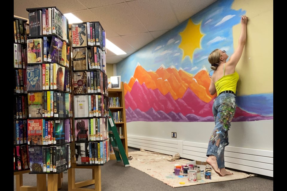
The Yorkton Public Library has a new mural adding to the atmosphere of the space.
Created by 19-year-old artist Mya Lauer, the art is part of a new youth space with the mural’s original design aiming to appeal to teens and young adults, but will also make all ages take pause, noted Branch Manager Amber Harvey.
“Mya has breathed life into our youth space and created a rich and expressive back drop to a spot of the Library that we hope makes all users feel joy and inspiration.” said Harvey.
Lauer is not new to mural creation in the city. She has previously completed projects at Tourism Yorkton, as well as the Refresh Spa building.
So are creating murals the preferred outlet for her art now?
“I really enjoy doing murals and will usually take any opportunity presented to create something large or outdoor,” Lauer told Yorkton This Week. “The only problem is that the chance to do a mural is quite limited.
“I enjoy all kinds of artistic expression but murals are certainly one of the most rewarding for me currently.”
So with some experience now with the format, is creating in a large scale becoming easier?
“I found it wasn’t too difficult of a transition but it definitely gets easier with practice like all things do,” said Lauer. “Taking time to step back and really look and to have a plan drawn out in the proper dimensions helps immensely.”
Lauer was asked to do the library piece after Tonia Vermette from the Yorkton Arts Council recommended her for the project.
From there the artist was given a rather broad palette from which to create the mural.
“I was given a vague idea of making something for a teen space, something fun and whimsical but not too immature,” said Lauer. “We bounced ideas off of each other for a while. I made a vision board and drew up some sketches until we had a final design decided on.
“It was a very enjoyable process.”
As for inspiration, Lauer focused on creating something which would appeal to the users of the new space.
“The library wanted something done specifically in the teen space so it was designed to appeal to that age group,” she said.
“The piece has a bulletin board in the centre that I had to work around.
“Colourful, whimsical and calming are some of the descriptors I focused on when designing.
“I really gravitated toward nature imagery and bright colours.
“I also wanted either side of the bulletin board to have a different colour scheme to make use of the space as well as allowing variety but keeping balance.”
The work did end up being more than Lauer had anticipated.
“It took a bit more time than I thought it would,” she said. “The stripes were all done freehand so that added some time.
“But considering all of the variables I think things went quite smoothly.”
And, the end result is gratifying.
“I am proud of it, there are certainly parts I could overwork for hours and be very picky about but overall it is done and it is beautiful and colourful and something I created from nothing and that's pretty amazing I think,” said Lauer.


